This map does not depict actual data. Instead, it has been carefully designed to be a diagnostic tool for evaluating the robustness of individual color schemes. Full use of this tool will benefit your map designs because colors (even very similar colors) are easy to differentiate when they appear in a nicely ordered sequence (such as a legend). The task of differentiating the colors, however, becomes much harder when the patterns on the map are complex, such as in the lower left corner of the diagnostic map.
TEST #1: Can you easily distinguish every color in the random section of the map (the lower left)? If you have a ten-class map, you should be able to see clearly ten unique colors.
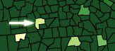
TEST #2: Within each large band of color on the map, we placed several polygons filled with each map color (‘outliers’). For example, if you have a seven-class map, there will be six outlier colors per band, demonstrating the appearance of all map colors with each as a surrounding color. Can you see each outlier clearly? Do all pairs of outliers in the band look different? If not, perhaps you should choose a different scheme or fewer classes.